Branding
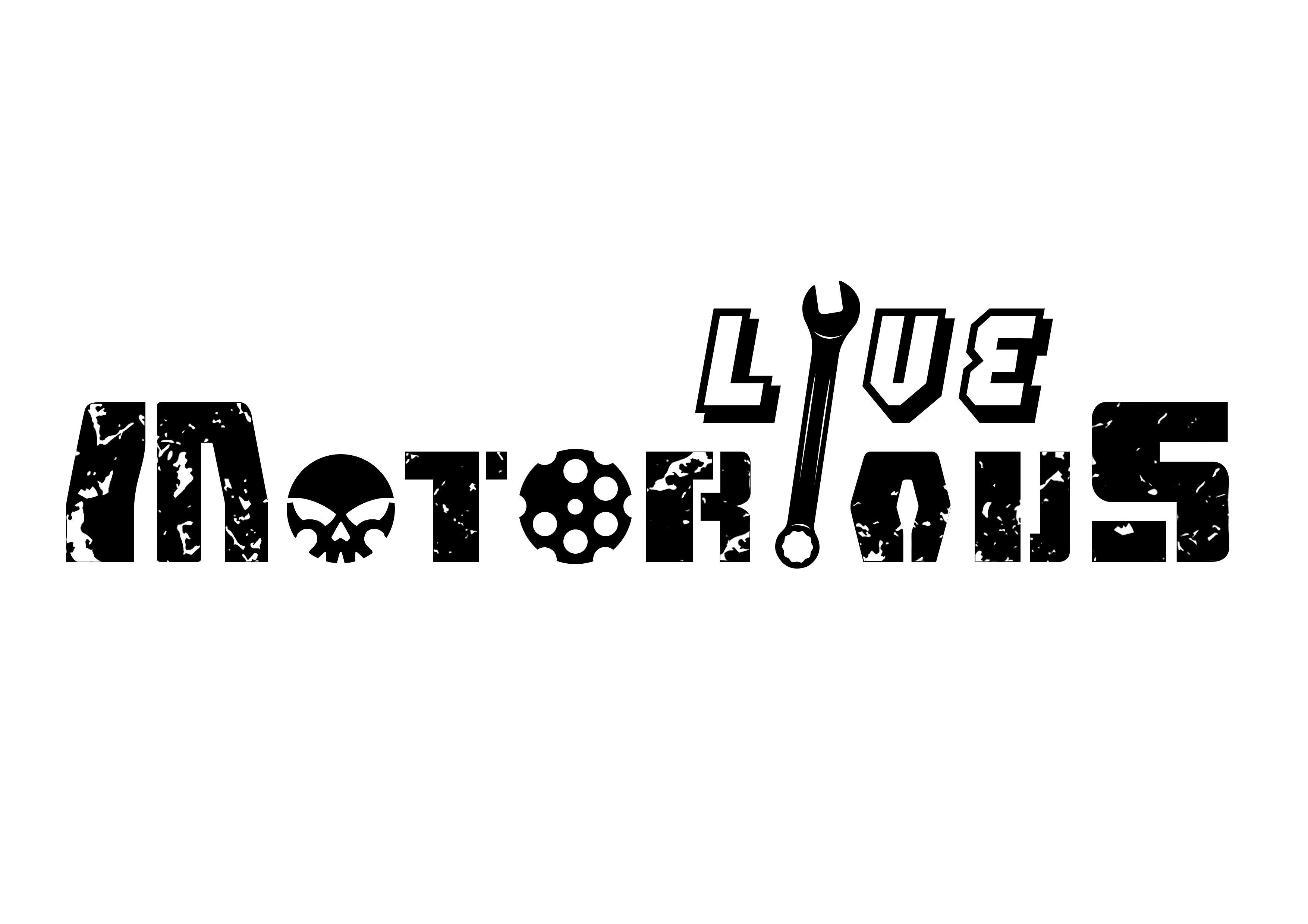
Live Motorious
Live Motorious is a clothing brand focused on bikers clothing and accesories. Here i got a chance to work for them and do a Logo Design, T-Shirt Design.
Year :
2025
Industry :
Clothing
Client :
LM
Project Duration :
1 weeks
Problem :
The brand Live Motorious needed a logo that could represent the raw energy and fearless attitude of the riding community. It had to capture the spirit of adventure, rebellion, and mechanics — appealing to riders who live and breathe their machines. The logo needed to look tough, industrial, and bold enough to stand out on apparel and accessories.

Challenge :
The main challenge was to merge motor culture symbolism (like gears, wrenches, and skulls) with a strong typographic identity — without making the design look cluttered or cliché. It also had to remain legible across different mediums (print, fabric, digital) while keeping that rough, distressed texture that defines biker aesthetics.


Solution :
The final design blends custom typography with mechanical elements — a wrench replacing a letter, gear and skull icons integrated within the text, and a distressed texture that gives the logo a rugged, worn-out metal feel. The word LIVE is styled in a bold, energetic font to emphasize motion and adrenaline, while MOTORIOUS uses a blocky, industrial form to convey strength and durability. Together, they create a dynamic balance between lifestyle and machinery — perfectly aligned with the brand’s essence.
Summary :
The Live Motorious logo embodies the heartbeat of riders — bold, gritty, and unapologetically raw. It communicates both identity and attitude, setting a strong foundation for the brand’s visual language. The design process evolved from exploring abstract mechanical forms to refining a symbol of freedom and power that feels built, not just designed.


More Projects

Branding
Live Motorious
Live Motorious is a clothing brand focused on bikers clothing and accesories. Here i got a chance to work for them and do a Logo Design, T-Shirt Design.
Year :
2025
Industry :
Clothing
Client :
LM
Project Duration :
1 weeks
Problem :
The brand Live Motorious needed a logo that could represent the raw energy and fearless attitude of the riding community. It had to capture the spirit of adventure, rebellion, and mechanics — appealing to riders who live and breathe their machines. The logo needed to look tough, industrial, and bold enough to stand out on apparel and accessories.
Challenge :
The main challenge was to merge motor culture symbolism (like gears, wrenches, and skulls) with a strong typographic identity — without making the design look cluttered or cliché. It also had to remain legible across different mediums (print, fabric, digital) while keeping that rough, distressed texture that defines biker aesthetics.
Solution :
The final design blends custom typography with mechanical elements — a wrench replacing a letter, gear and skull icons integrated within the text, and a distressed texture that gives the logo a rugged, worn-out metal feel. The word LIVE is styled in a bold, energetic font to emphasize motion and adrenaline, while MOTORIOUS uses a blocky, industrial form to convey strength and durability. Together, they create a dynamic balance between lifestyle and machinery — perfectly aligned with the brand’s essence.
Summary :
The Live Motorious logo embodies the heartbeat of riders — bold, gritty, and unapologetically raw. It communicates both identity and attitude, setting a strong foundation for the brand’s visual language. The design process evolved from exploring abstract mechanical forms to refining a symbol of freedom and power that feels built, not just designed.
More Projects
Branding
Live Motorious
Live Motorious is a clothing brand focused on bikers clothing and accesories. Here i got a chance to work for them and do a Logo Design, T-Shirt Design.
Year :
2025
Industry :
Clothing
Client :
LM
Project Duration :
1 weeks
Problem :
The brand Live Motorious needed a logo that could represent the raw energy and fearless attitude of the riding community. It had to capture the spirit of adventure, rebellion, and mechanics — appealing to riders who live and breathe their machines. The logo needed to look tough, industrial, and bold enough to stand out on apparel and accessories.
Challenge :
The main challenge was to merge motor culture symbolism (like gears, wrenches, and skulls) with a strong typographic identity — without making the design look cluttered or cliché. It also had to remain legible across different mediums (print, fabric, digital) while keeping that rough, distressed texture that defines biker aesthetics.
Solution :
The final design blends custom typography with mechanical elements — a wrench replacing a letter, gear and skull icons integrated within the text, and a distressed texture that gives the logo a rugged, worn-out metal feel. The word LIVE is styled in a bold, energetic font to emphasize motion and adrenaline, while MOTORIOUS uses a blocky, industrial form to convey strength and durability. Together, they create a dynamic balance between lifestyle and machinery — perfectly aligned with the brand’s essence.
Summary :
The Live Motorious logo embodies the heartbeat of riders — bold, gritty, and unapologetically raw. It communicates both identity and attitude, setting a strong foundation for the brand’s visual language. The design process evolved from exploring abstract mechanical forms to refining a symbol of freedom and power that feels built, not just designed.