Branding
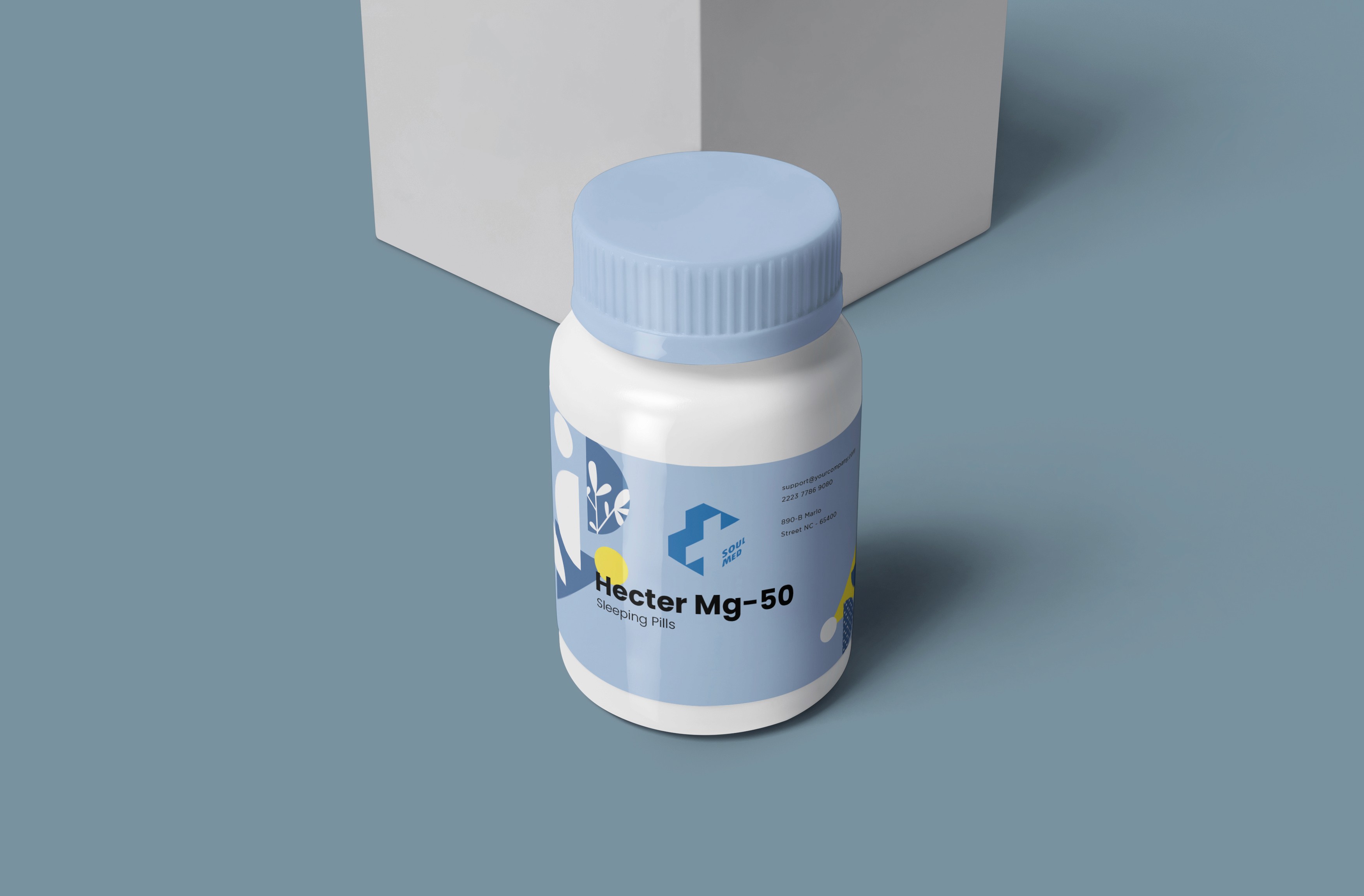
Soul Med
SoulMed is a modern medical store that combines trust, care, and innovation — providing reliable healthcare solutions with a human touch.
Year :
2025
Industry :
Medicine / Pharmaceutical
Client :
SM Azir
Project Duration :
2 weeks
Problem :
The brand SoulMed needed a logo that visually communicated trust, care, and modern healthcare accessibility. As a medical store, the identity had to stand out in a market often saturated with generic red cross icons while still conveying reliability, safety, and a human-centered approach.
Challenge :
The main challenge was to reimagine the classic medical cross in a way that felt fresh and memorable — without losing its universal recognition. The logo also needed to represent both physical healthcare and digital service expansion, maintaining a professional yet warm tone. Balancing minimalism with distinctiveness was key.

Solution :
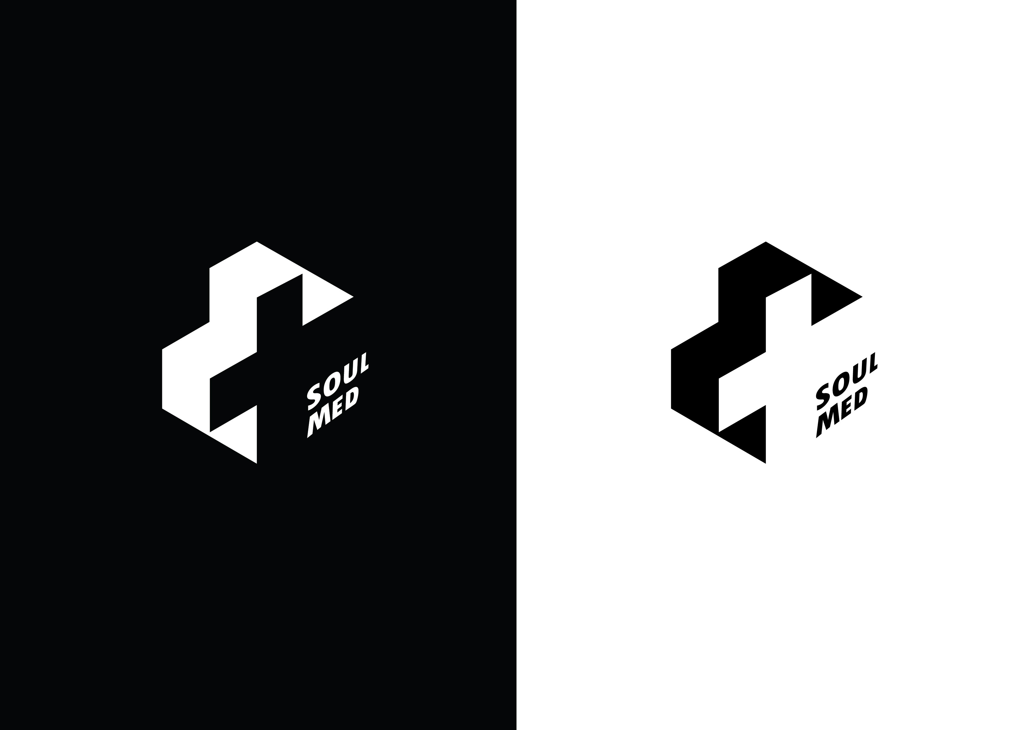
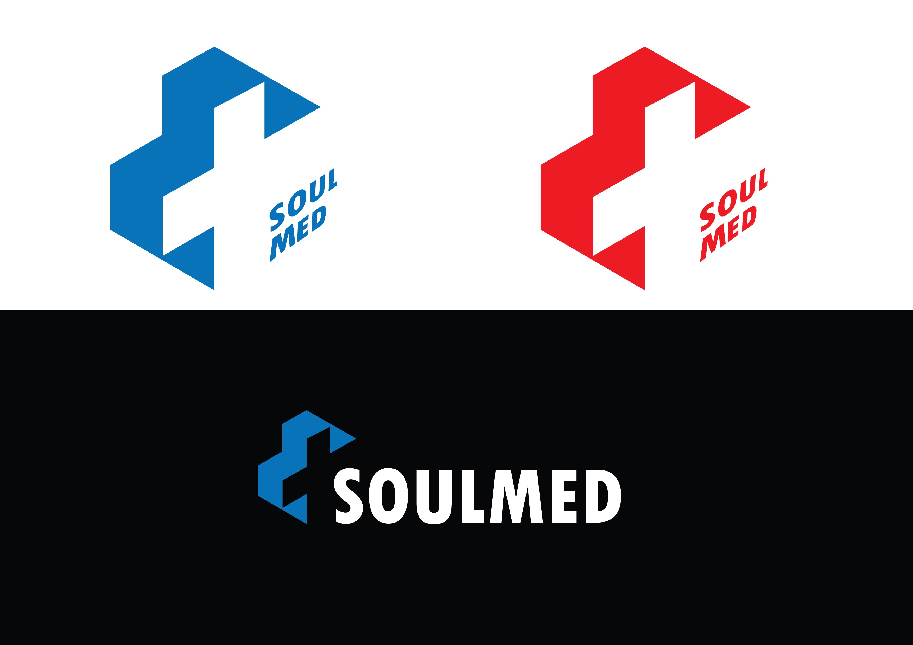
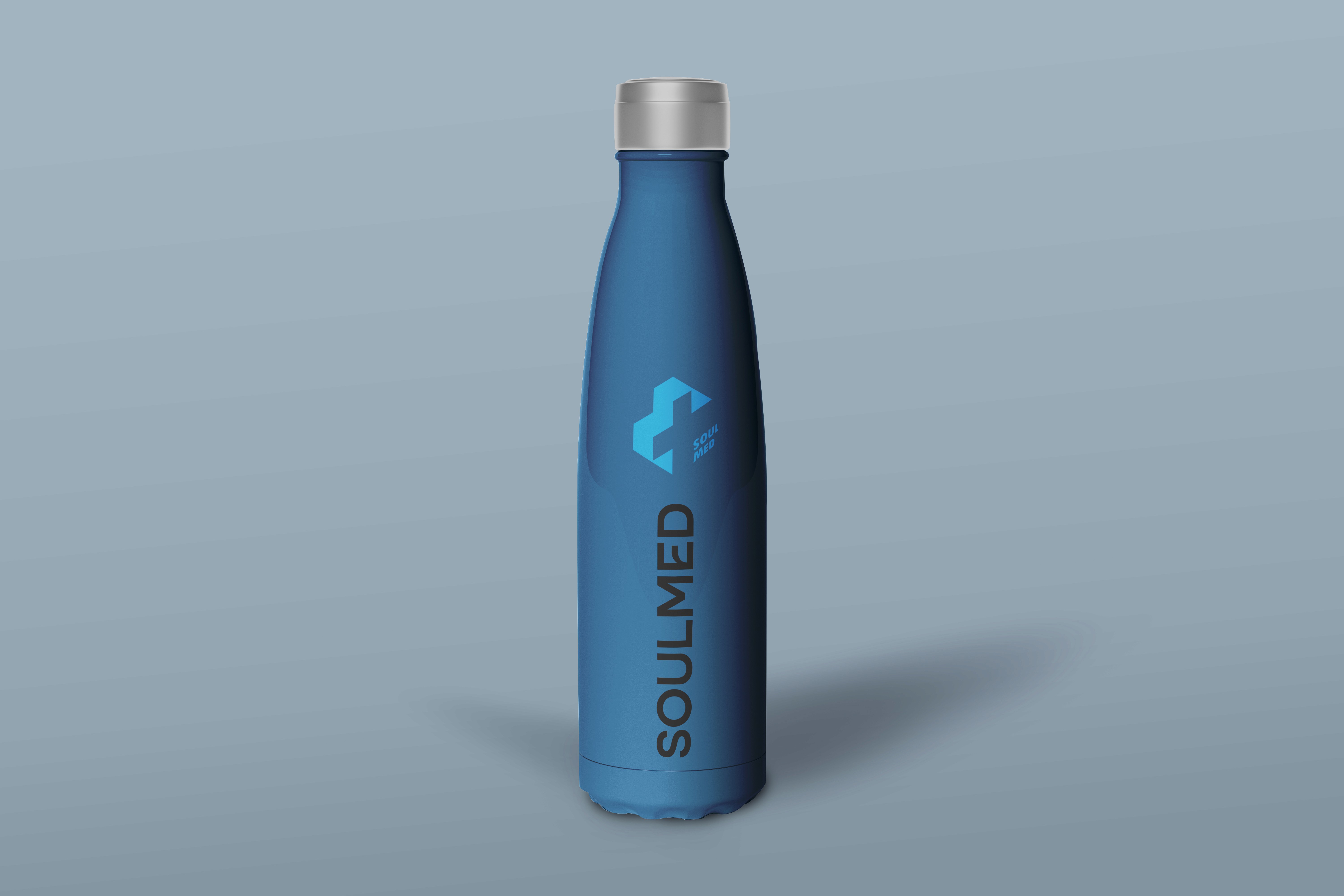
The final design uses a geometric 3D-inspired cross, symbolizing structure, stability, and interconnectedness — qualities that define a modern healthcare provider. The clean blue color conveys trust and calmness, while the angular shapes add a sense of precision and innovation. The name SoulMed is positioned within the form, emphasizing the idea of soulful medicine — care with depth, not just service. The result is a mark that feels both technical and compassionate.
Summary :
The SoulMed logo blends modern geometry with classic medical symbolism, creating an identity that’s clean, trustworthy, and forward-looking. It visually represents the brand’s mission — combining technology, reliability, and empathy in healthcare. The design stands as a timeless and scalable mark suitable for both digital platforms and retail presence.
More Projects


Branding
Soul Med
SoulMed is a modern medical store that combines trust, care, and innovation — providing reliable healthcare solutions with a human touch.
Year :
2025
Industry :
Medicine / Pharmaceutical
Client :
SM Azir
Project Duration :
2 weeks
Problem :
The brand SoulMed needed a logo that visually communicated trust, care, and modern healthcare accessibility. As a medical store, the identity had to stand out in a market often saturated with generic red cross icons while still conveying reliability, safety, and a human-centered approach.
Challenge :
The main challenge was to reimagine the classic medical cross in a way that felt fresh and memorable — without losing its universal recognition. The logo also needed to represent both physical healthcare and digital service expansion, maintaining a professional yet warm tone. Balancing minimalism with distinctiveness was key.
Solution :
The final design uses a geometric 3D-inspired cross, symbolizing structure, stability, and interconnectedness — qualities that define a modern healthcare provider. The clean blue color conveys trust and calmness, while the angular shapes add a sense of precision and innovation. The name SoulMed is positioned within the form, emphasizing the idea of soulful medicine — care with depth, not just service. The result is a mark that feels both technical and compassionate.
Summary :
The SoulMed logo blends modern geometry with classic medical symbolism, creating an identity that’s clean, trustworthy, and forward-looking. It visually represents the brand’s mission — combining technology, reliability, and empathy in healthcare. The design stands as a timeless and scalable mark suitable for both digital platforms and retail presence.
More Projects
Branding
Soul Med
SoulMed is a modern medical store that combines trust, care, and innovation — providing reliable healthcare solutions with a human touch.
Year :
2025
Industry :
Medicine / Pharmaceutical
Client :
SM Azir
Project Duration :
2 weeks
Problem :
The brand SoulMed needed a logo that visually communicated trust, care, and modern healthcare accessibility. As a medical store, the identity had to stand out in a market often saturated with generic red cross icons while still conveying reliability, safety, and a human-centered approach.
Challenge :
The main challenge was to reimagine the classic medical cross in a way that felt fresh and memorable — without losing its universal recognition. The logo also needed to represent both physical healthcare and digital service expansion, maintaining a professional yet warm tone. Balancing minimalism with distinctiveness was key.
Solution :
The final design uses a geometric 3D-inspired cross, symbolizing structure, stability, and interconnectedness — qualities that define a modern healthcare provider. The clean blue color conveys trust and calmness, while the angular shapes add a sense of precision and innovation. The name SoulMed is positioned within the form, emphasizing the idea of soulful medicine — care with depth, not just service. The result is a mark that feels both technical and compassionate.
Summary :
The SoulMed logo blends modern geometry with classic medical symbolism, creating an identity that’s clean, trustworthy, and forward-looking. It visually represents the brand’s mission — combining technology, reliability, and empathy in healthcare. The design stands as a timeless and scalable mark suitable for both digital platforms and retail presence.