Branding
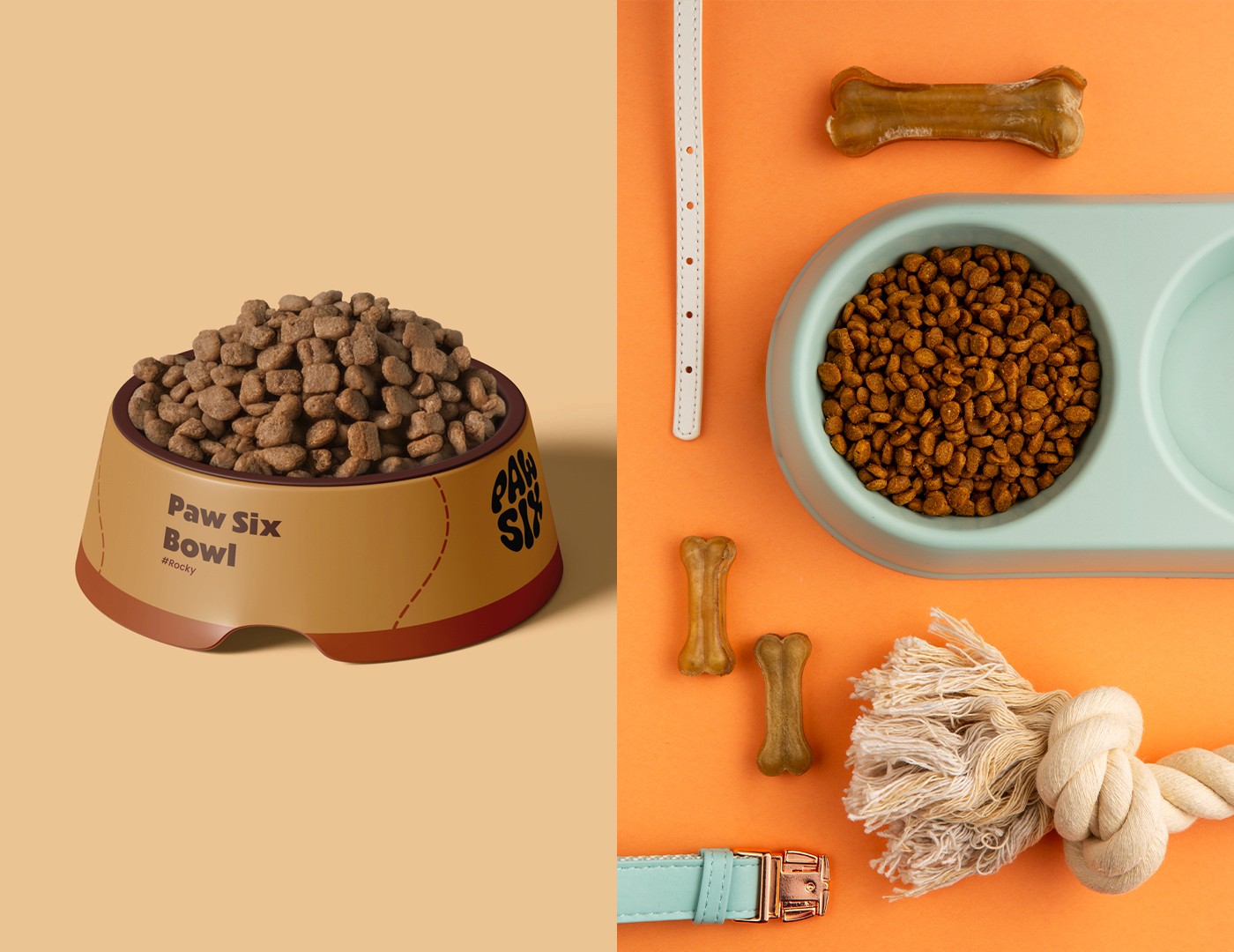
Paw Six
Crafted the Paw Six brand identity to reflect its mission of delivering wholesome pet food and wellness essentials.
Year :
2025
Industry :
Pet / Wellness
Client :
Matthew Brinks
Project Duration :
4 weeks
Problem :
Paw Six was launching without any pre-existing visual identity. The challenge was that the market was already saturated with competitors using overly clinical and generic branding (cold blues, stark whites, uninspired typefaces). Without a distinct visual voice, Paw Six risked being immediately perceived as unapproachable or simply another low-recall option. The objective was to avoid this generic pitfall and ensure the initial launch communicated warmth, natural appeal, and high quality from day one.

Challenge :
The core challenge was to create an identity from zero that immediately built immediate trust in the new brand while conveying the joy and health benefits of the products. This required more than just an attractive logo; it needed an entire visual system that felt empathetic, natural, and memorable. The goal was to establish a brand that instantly stood out by visually communicating both premium wellness and the deep bond people share with their pets, ensuring the visual language felt as nourishing as the food itself.


Solution :
The solution for Paw Six involved designing a brand identity centered around the distinctive, organic-shaped logo and its earthy color palette. The playful, custom typography immediately conveys a friendly, approachable, and trustworthy personality, establishing the brand's unique tone. The use of warm, natural tones evokes a sense of wholesome ingredients and genuine care—a direct counterpoint to sterile competitors. This unique visual language builds a powerful emotional connection with pet owners at launch, positioning Paw Six as a brand that understands and celebrates the joy of pet companionship and well-being, fostering both premium perception and community loyalty.
Summary :
The successful launch of Paw Six was driven by the creation of a vibrant, trustworthy, and emotionally engaging brand identity from the ground up. By deliberately avoiding the generic, clinical visual cues common in the pet industry, the new identity embraced an organic, playful, and naturally colored aesthetic. The distinctive logo and cohesive visual system ensure Paw Six is immediately positioned to thrive by resonating deeply with its target audience and standing out as a leader in pet health and happiness upon entering the market.


More Projects

Branding
Paw Six
Crafted the Paw Six brand identity to reflect its mission of delivering wholesome pet food and wellness essentials.
Year :
2025
Industry :
Pet / Wellness
Client :
Matthew Brinks
Project Duration :
4 weeks
Problem :
Paw Six was launching without any pre-existing visual identity. The challenge was that the market was already saturated with competitors using overly clinical and generic branding (cold blues, stark whites, uninspired typefaces). Without a distinct visual voice, Paw Six risked being immediately perceived as unapproachable or simply another low-recall option. The objective was to avoid this generic pitfall and ensure the initial launch communicated warmth, natural appeal, and high quality from day one.
Challenge :
The core challenge was to create an identity from zero that immediately built immediate trust in the new brand while conveying the joy and health benefits of the products. This required more than just an attractive logo; it needed an entire visual system that felt empathetic, natural, and memorable. The goal was to establish a brand that instantly stood out by visually communicating both premium wellness and the deep bond people share with their pets, ensuring the visual language felt as nourishing as the food itself.
Solution :
The solution for Paw Six involved designing a brand identity centered around the distinctive, organic-shaped logo and its earthy color palette. The playful, custom typography immediately conveys a friendly, approachable, and trustworthy personality, establishing the brand's unique tone. The use of warm, natural tones evokes a sense of wholesome ingredients and genuine care—a direct counterpoint to sterile competitors. This unique visual language builds a powerful emotional connection with pet owners at launch, positioning Paw Six as a brand that understands and celebrates the joy of pet companionship and well-being, fostering both premium perception and community loyalty.
Summary :
The successful launch of Paw Six was driven by the creation of a vibrant, trustworthy, and emotionally engaging brand identity from the ground up. By deliberately avoiding the generic, clinical visual cues common in the pet industry, the new identity embraced an organic, playful, and naturally colored aesthetic. The distinctive logo and cohesive visual system ensure Paw Six is immediately positioned to thrive by resonating deeply with its target audience and standing out as a leader in pet health and happiness upon entering the market.
More Projects
Branding
Paw Six
Crafted the Paw Six brand identity to reflect its mission of delivering wholesome pet food and wellness essentials.
Year :
2025
Industry :
Pet / Wellness
Client :
Matthew Brinks
Project Duration :
4 weeks
Problem :
Paw Six was launching without any pre-existing visual identity. The challenge was that the market was already saturated with competitors using overly clinical and generic branding (cold blues, stark whites, uninspired typefaces). Without a distinct visual voice, Paw Six risked being immediately perceived as unapproachable or simply another low-recall option. The objective was to avoid this generic pitfall and ensure the initial launch communicated warmth, natural appeal, and high quality from day one.
Challenge :
The core challenge was to create an identity from zero that immediately built immediate trust in the new brand while conveying the joy and health benefits of the products. This required more than just an attractive logo; it needed an entire visual system that felt empathetic, natural, and memorable. The goal was to establish a brand that instantly stood out by visually communicating both premium wellness and the deep bond people share with their pets, ensuring the visual language felt as nourishing as the food itself.
Solution :
The solution for Paw Six involved designing a brand identity centered around the distinctive, organic-shaped logo and its earthy color palette. The playful, custom typography immediately conveys a friendly, approachable, and trustworthy personality, establishing the brand's unique tone. The use of warm, natural tones evokes a sense of wholesome ingredients and genuine care—a direct counterpoint to sterile competitors. This unique visual language builds a powerful emotional connection with pet owners at launch, positioning Paw Six as a brand that understands and celebrates the joy of pet companionship and well-being, fostering both premium perception and community loyalty.
Summary :
The successful launch of Paw Six was driven by the creation of a vibrant, trustworthy, and emotionally engaging brand identity from the ground up. By deliberately avoiding the generic, clinical visual cues common in the pet industry, the new identity embraced an organic, playful, and naturally colored aesthetic. The distinctive logo and cohesive visual system ensure Paw Six is immediately positioned to thrive by resonating deeply with its target audience and standing out as a leader in pet health and happiness upon entering the market.