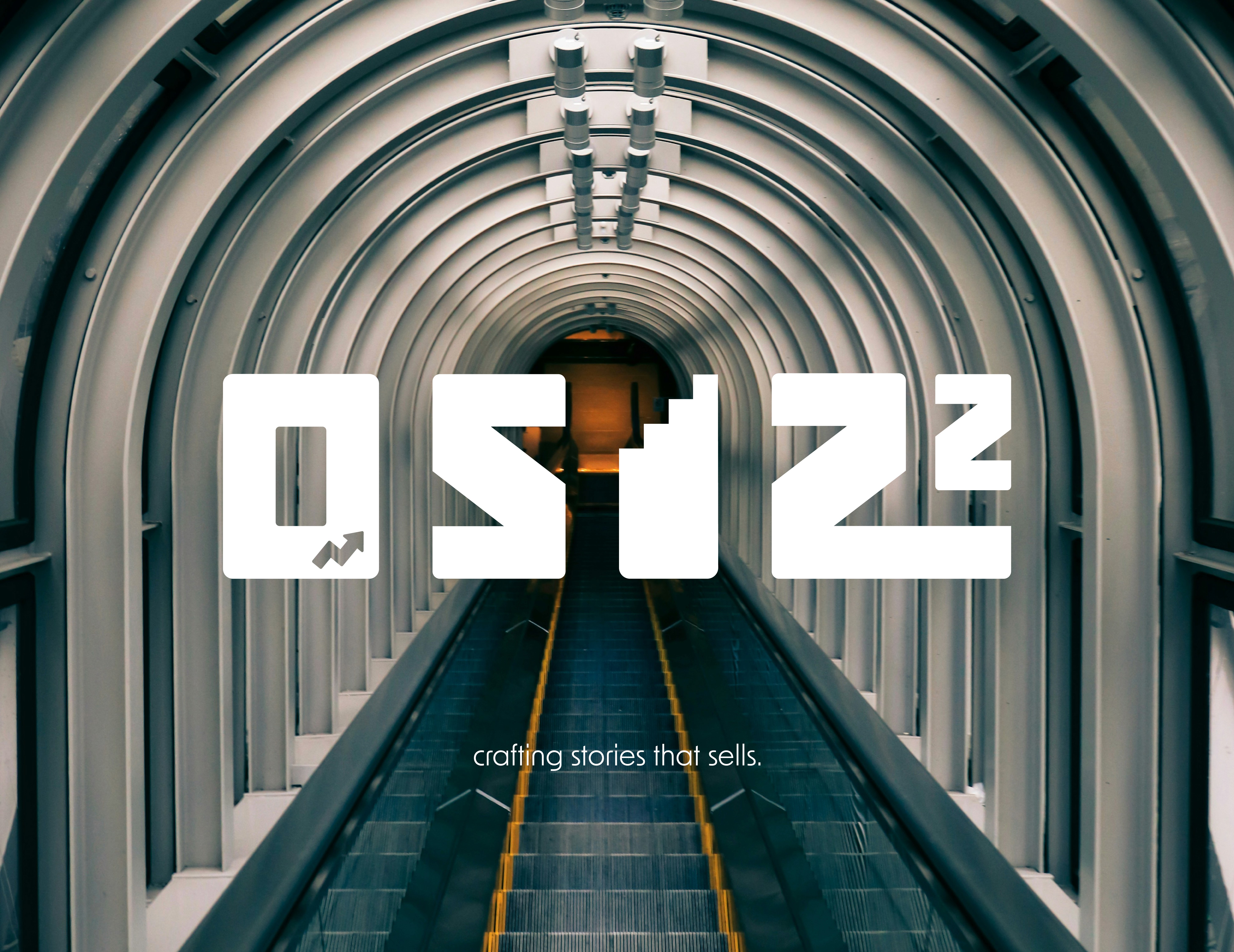
Branding
OSIZZ DIGITAL MARKETING AGENCY
Created a completed new look for their brand agency setting a particular theme, typography and brand guideline. With this complete brand makeover we made a drastic change in their sales and clients which worked well for them.
Year :
2025
Industry :
Marketing Agency
Client :
Osizz
Project Duration :
3 weeks
Problem :
Osizz Marketing Agency's previous branding, centered on a generic combination of light grey, white, and orange tones, created significant market challenges. This common, high-energy palette resulted in a crippling lack of differentiation, making Osizz indistinguishable from generic competitors and fostering the perception of an "entry-level" firm. The orange hue, while enthusiastic, fatally lacked the necessary gravitas and authority required to secure trust in the B2B strategic space, ultimately restricting the agency's growth potential and digital impact.

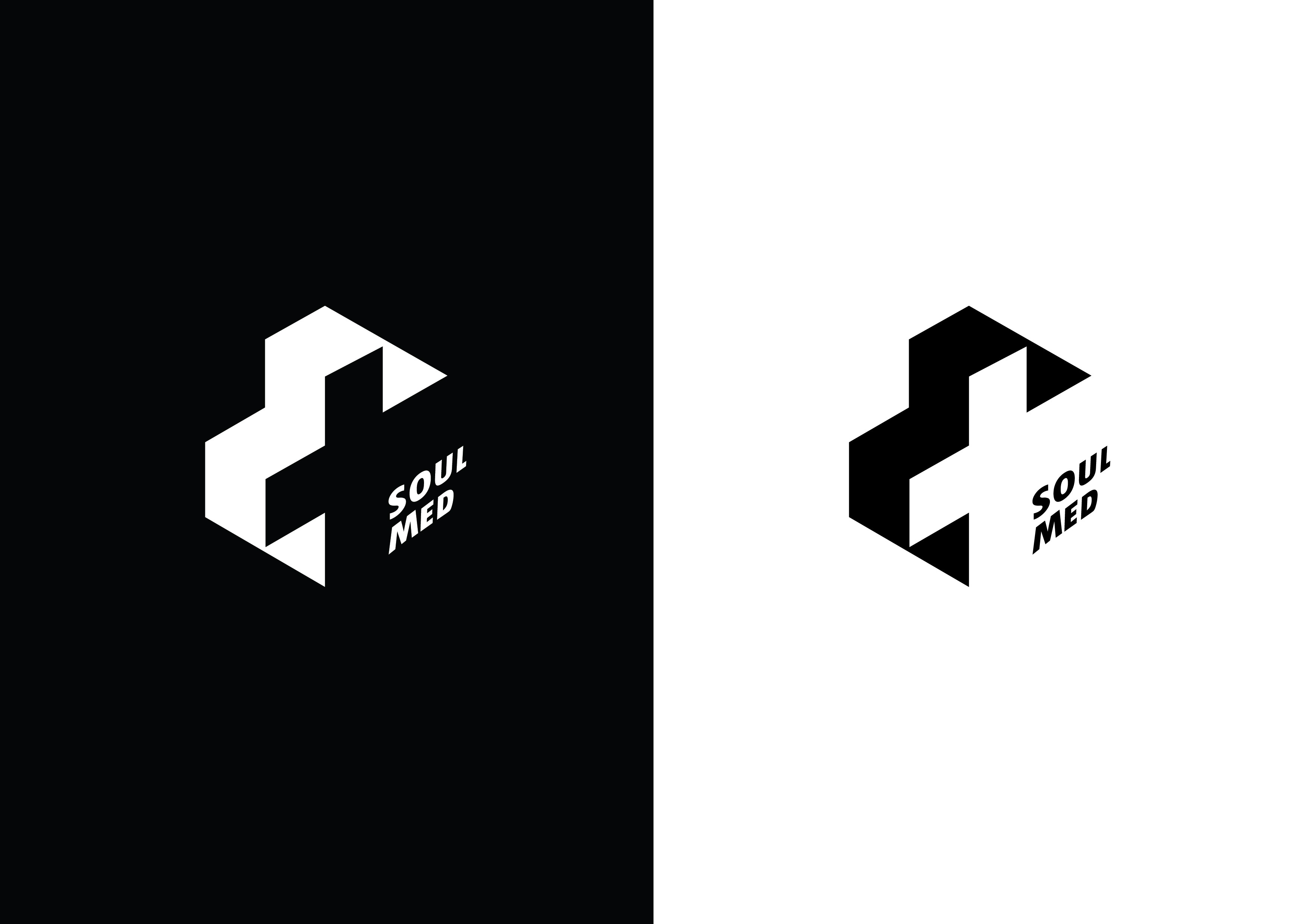
Solution :
The core challenge in the rebrand was creating a unified identity capable of reflecting the agency's dual nature—sophisticated, data-driven strategy alongside dynamic, creative innovation. This required a solution that addressed the complex interplay between visual symbolism, strategic color cohesion, and maintaining a consistent brand voice across diverse client materials to ensure the final brand experience felt unified and authoritative.


Solution :
The solution involved engineering a modern, high-contrast visual system using a strategic palette of Deep Blue, Black, Purple, Teal, and White to instantly elevate Osizz's market position. This sophisticated identity leverages Deep Blue and Black to establish immediate authority, stability, and premium quality, directly countering the previous brand's generic image. The inclusion of Purple and Teal as dynamic accents provides the necessary dimension to highlight innovation and technological precision, ensuring the brand reflects its dual strength in creativity and data science. This future-proof palette is highly memorable, digitally accessible, and perfectly aligned with Osizz's commitment to delivering cutting-edge, strategic results.
Summary :
The rebrand of Osizz Marketing Agency successfully navigated the transition from a generic, high-energy orange palette—which hindered differentiation and trust—to a sophisticated, strategic visual identity. The project's core challenge was the fusion of data-driven authority and creative dynamism. This was solved by implementing a modern color system featuring Deep Blue and Black for gravitas, complemented by Purple and Teal accents for innovation. The resulting brand is cohesive, premium, and distinctively positioned to attract higher-tier B2B clients and support Osizz's strategic growth ambitions.


More Projects


Branding
OSIZZ DIGITAL MARKETING AGENCY
Created a completed new look for their brand agency setting a particular theme, typography and brand guideline. With this complete brand makeover we made a drastic change in their sales and clients which worked well for them.
Year :
2025
Industry :
Marketing Agency
Client :
Osizz
Project Duration :
3 weeks
Problem :
Osizz Marketing Agency's previous branding, centered on a generic combination of light grey, white, and orange tones, created significant market challenges. This common, high-energy palette resulted in a crippling lack of differentiation, making Osizz indistinguishable from generic competitors and fostering the perception of an "entry-level" firm. The orange hue, while enthusiastic, fatally lacked the necessary gravitas and authority required to secure trust in the B2B strategic space, ultimately restricting the agency's growth potential and digital impact.
Solution :
The core challenge in the rebrand was creating a unified identity capable of reflecting the agency's dual nature—sophisticated, data-driven strategy alongside dynamic, creative innovation. This required a solution that addressed the complex interplay between visual symbolism, strategic color cohesion, and maintaining a consistent brand voice across diverse client materials to ensure the final brand experience felt unified and authoritative.
Solution :
The solution involved engineering a modern, high-contrast visual system using a strategic palette of Deep Blue, Black, Purple, Teal, and White to instantly elevate Osizz's market position. This sophisticated identity leverages Deep Blue and Black to establish immediate authority, stability, and premium quality, directly countering the previous brand's generic image. The inclusion of Purple and Teal as dynamic accents provides the necessary dimension to highlight innovation and technological precision, ensuring the brand reflects its dual strength in creativity and data science. This future-proof palette is highly memorable, digitally accessible, and perfectly aligned with Osizz's commitment to delivering cutting-edge, strategic results.
Summary :
The rebrand of Osizz Marketing Agency successfully navigated the transition from a generic, high-energy orange palette—which hindered differentiation and trust—to a sophisticated, strategic visual identity. The project's core challenge was the fusion of data-driven authority and creative dynamism. This was solved by implementing a modern color system featuring Deep Blue and Black for gravitas, complemented by Purple and Teal accents for innovation. The resulting brand is cohesive, premium, and distinctively positioned to attract higher-tier B2B clients and support Osizz's strategic growth ambitions.
More Projects
Branding
OSIZZ DIGITAL MARKETING AGENCY
Created a completed new look for their brand agency setting a particular theme, typography and brand guideline. With this complete brand makeover we made a drastic change in their sales and clients which worked well for them.
Year :
2025
Industry :
Marketing Agency
Client :
Osizz
Project Duration :
3 weeks
Problem :
Osizz Marketing Agency's previous branding, centered on a generic combination of light grey, white, and orange tones, created significant market challenges. This common, high-energy palette resulted in a crippling lack of differentiation, making Osizz indistinguishable from generic competitors and fostering the perception of an "entry-level" firm. The orange hue, while enthusiastic, fatally lacked the necessary gravitas and authority required to secure trust in the B2B strategic space, ultimately restricting the agency's growth potential and digital impact.
Solution :
The core challenge in the rebrand was creating a unified identity capable of reflecting the agency's dual nature—sophisticated, data-driven strategy alongside dynamic, creative innovation. This required a solution that addressed the complex interplay between visual symbolism, strategic color cohesion, and maintaining a consistent brand voice across diverse client materials to ensure the final brand experience felt unified and authoritative.
Solution :
The solution involved engineering a modern, high-contrast visual system using a strategic palette of Deep Blue, Black, Purple, Teal, and White to instantly elevate Osizz's market position. This sophisticated identity leverages Deep Blue and Black to establish immediate authority, stability, and premium quality, directly countering the previous brand's generic image. The inclusion of Purple and Teal as dynamic accents provides the necessary dimension to highlight innovation and technological precision, ensuring the brand reflects its dual strength in creativity and data science. This future-proof palette is highly memorable, digitally accessible, and perfectly aligned with Osizz's commitment to delivering cutting-edge, strategic results.
Summary :
The rebrand of Osizz Marketing Agency successfully navigated the transition from a generic, high-energy orange palette—which hindered differentiation and trust—to a sophisticated, strategic visual identity. The project's core challenge was the fusion of data-driven authority and creative dynamism. This was solved by implementing a modern color system featuring Deep Blue and Black for gravitas, complemented by Purple and Teal accents for innovation. The resulting brand is cohesive, premium, and distinctively positioned to attract higher-tier B2B clients and support Osizz's strategic growth ambitions.